Our Branding Journey
News
06 September 2021
“Revive needed a brand to change mindsets.”
Lisa Adamson & Laura Service, ilka
As Revive has grown over the years, it’s become clear to us that the look and feel of our brand hasn’t always been 100% in line with our values: transparency, simplicity, and innovation. That’s why, over the last few months, we’ve been working with the wonderful folks over at ilka – Scotland’s first B Corp design studio – to overhaul Revive’s website and overall branding, in an effort to make it more us.
We spoke to Lisa and Laura from ilka about the choices they made in helping us on our branding journey to rebrand Revive, and the thinking behind our new website.
“Revive needed a brand to change mindsets; engaging a large and varied audience to join them on their mission of making waste a want. Through a strategy workshop with the team we were able to identify challenges. Define their mission, and pinpoint the key drivers of their organisation to help focus design and messaging going forward.
Tone of voice
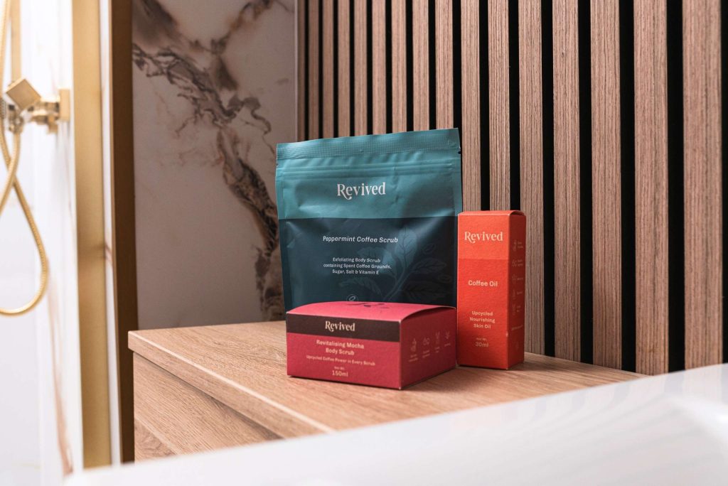
To begin building a community, we knew we needed to simplify Revive’s high concept innovation to make their business and mission tangible. Introducing the tagline ‘Radical Reincarnation’ helped us convey the overall mission of Revive. To give continuous life to any material, ultimately creating a waste free world. Three simple steps supported with iconography made communication of their process as accessible as possible.

Logo
We kept the logo simple and refined to appeal to a varied audience. Adding animation helped to convey the important values of reinvention and circularity.
Stamps & Icons
Rebuilding broken systems and innovating high value ingredients from waste. Revive needed icons to help them communicate in almost scientific form. There is a huge amount of thinking, logistics and quality control behind each product created by Revive. We developed Stamps. To act as a mark of trust in anything collected or produced by the organisation and their community.
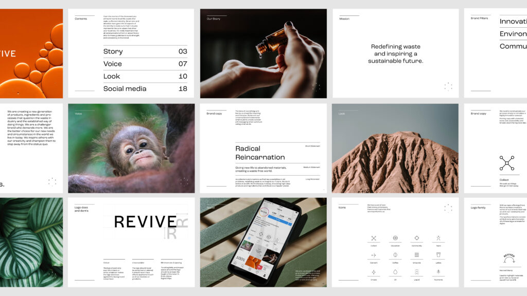
The brand is brought to life by using motion and stills. Focusing in on the beauty and detail of raw materials to the environments, animals and people they positively impact.
It was an absolute pleasure to work with the team at Revive. An inspirational organisation creating powerful possibilities to some of the world’s biggest problems. Continually putting Scotland on the map as a country who demands more for our planet.”